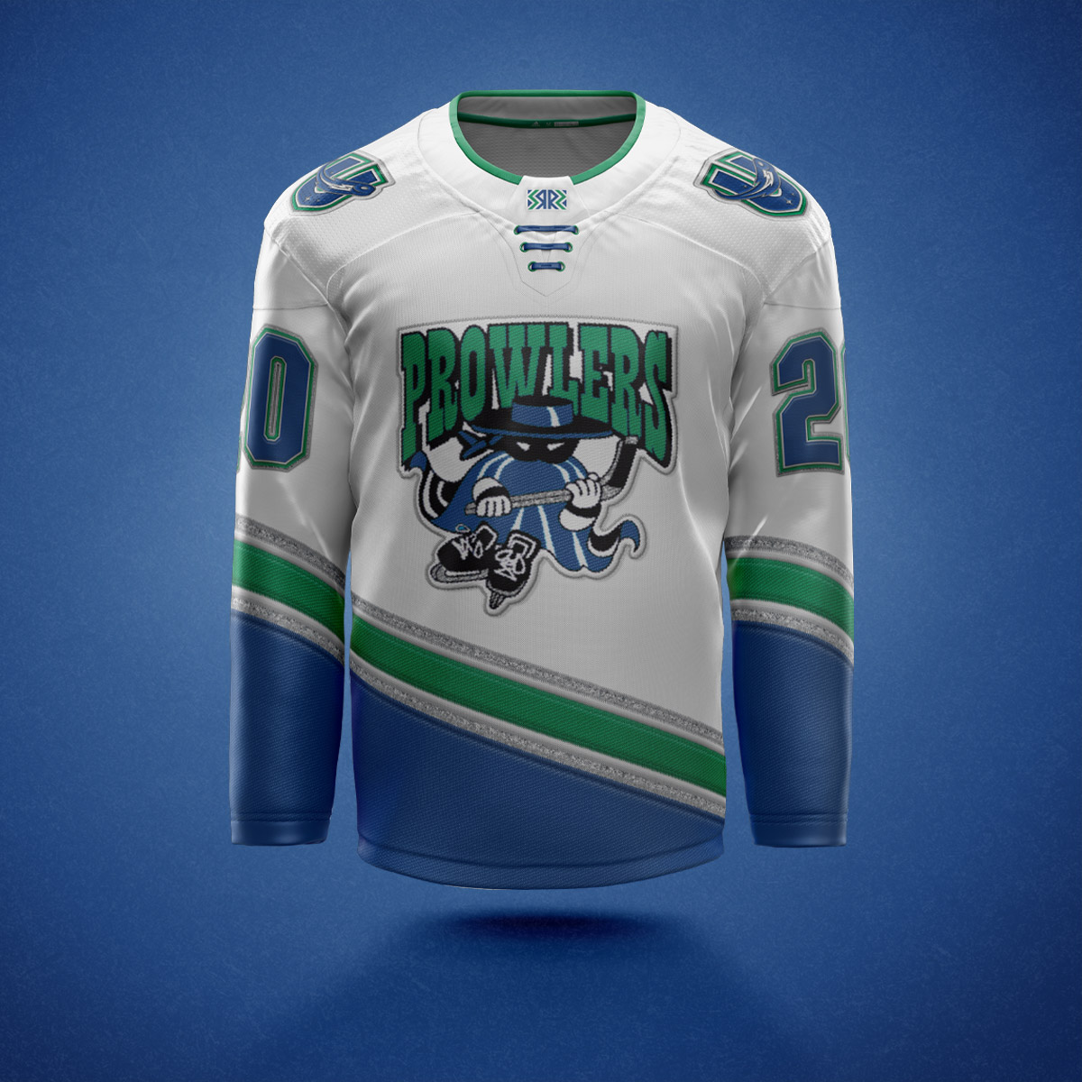
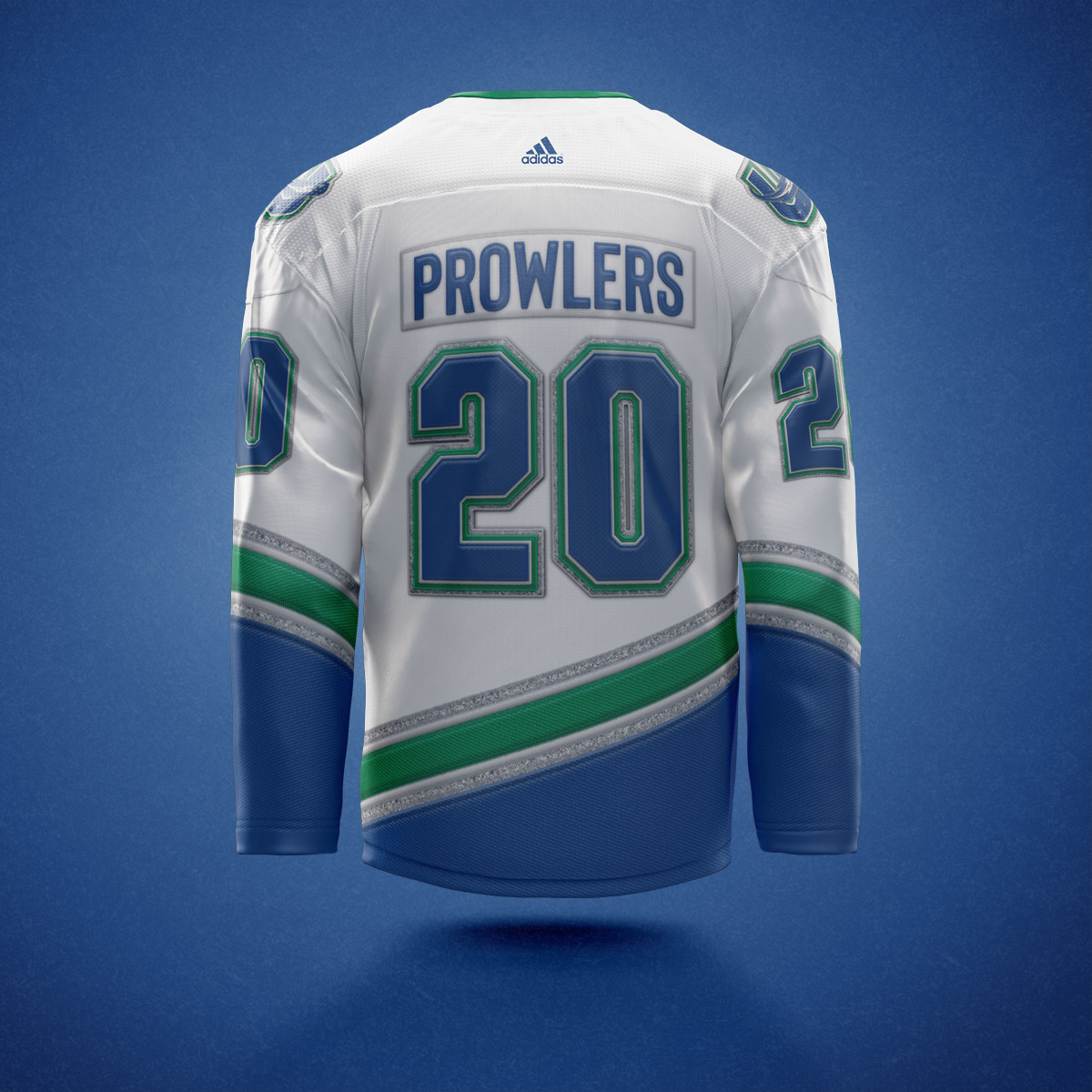
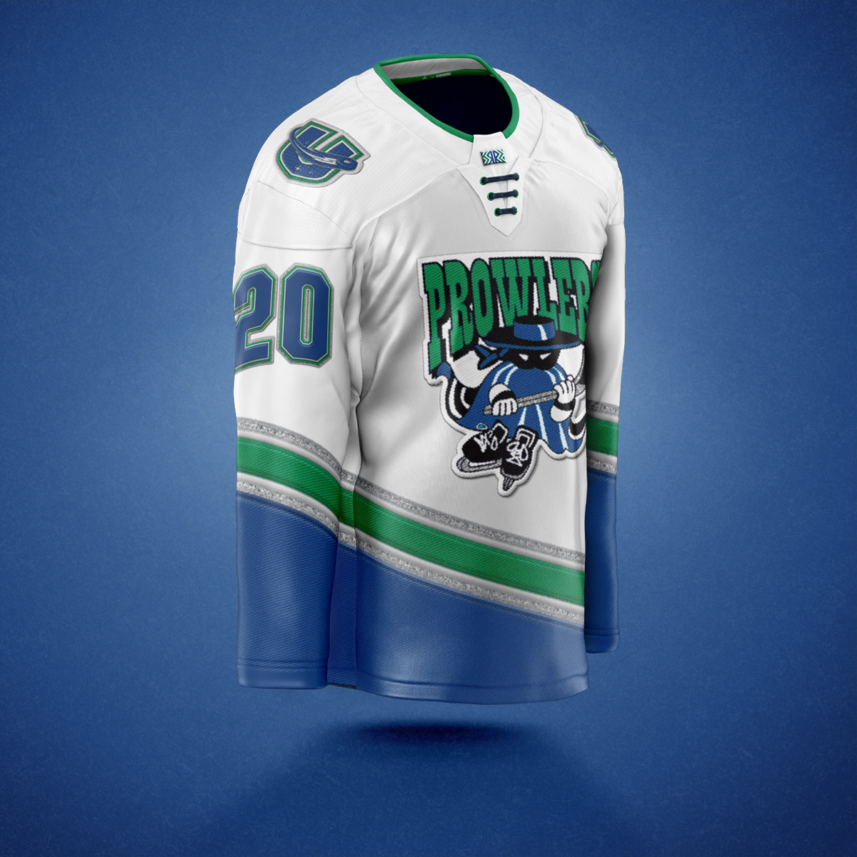
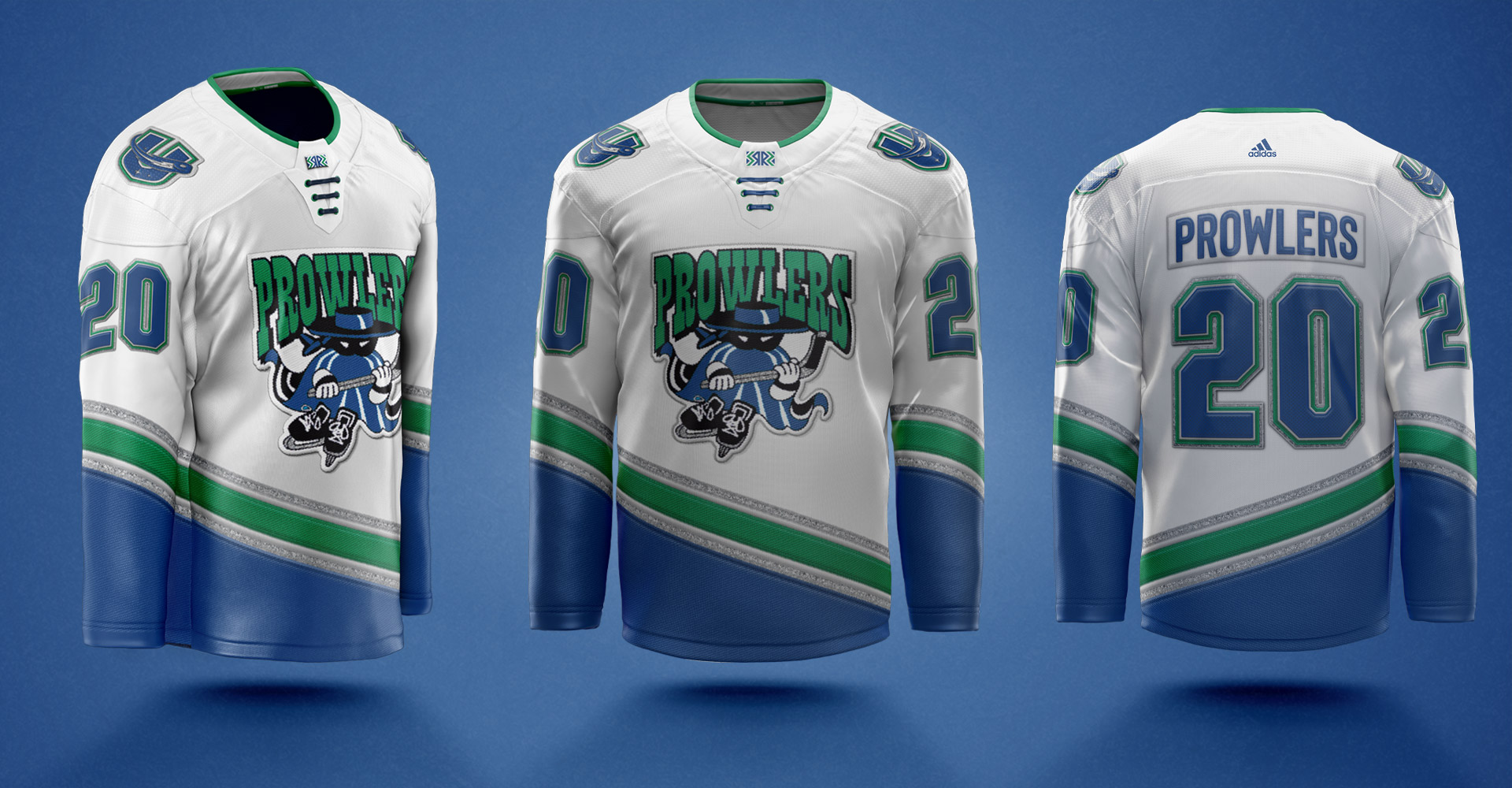
THis year the NHL introduced a reverse retro jersey for every team. Bringing back old logos and color schemes, and in some cases using logos from different teams such as Carolina bringing back the Hartford Whalers logo, and Colorado's jerseys featuring the Quebec Nordiques.
I had the idea to design a reverse retro jerseys for the Utica Comets, and my first idea was to bring back a classic logo for a team that played in the building when I was a kid.
The Mohawk Valley Prowlers were my first hockey love, the first team I cared about as a kid. I loved the jerseys, the logo, the mascott. I loved it all. Bringing back the beloved logo, and updating it to feature the Comets color scheme was my first move.
I also used the Prowlers old jerseys as inspiration for the layout here, the Prowlers jerseys heavily featured a gray color but I honestly never like the use of gray. So I swapped it out for a sparkly silver texture, similar to the glittery gold texture of the Vegas Golden Knights jerseys.
I think if the Comets released these jerseys, they would be a huge success locally.


